When smartphones became mainstream in the early 2010s, they brought with them not just new ways to communicate, but a revolutionary mode of human–device interaction. The mobile app—compact, purposeful, and personal—emerged as the defining digital artifact of the decade. Those early years of app development set the tone for what users would come to expect from mobile software and how designers would approach the craft of interface creation.
In the beginning, mobile app design was guided primarily by adaptation. Developers had to translate desktop experiences into smaller screens without losing clarity or functionality. This challenge gave rise to the first principles of responsive design: simplicity, legibility, and intuitive navigation. Because touchscreens lacked the precision of a mouse, interface elements had to become larger, gestures had to replace clicks, and information architecture had to be condensed and reorganized to fit into users’ hands.
The user interfaces of the early 2010s were heavily inspired by skeuomorphism—a design philosophy that borrowed textures, icons, and visual metaphors from the physical world. Buttons looked pressable, note-taking apps resembled notepads, and calendars mimicked printed planners. This aesthetic served a psychological function: it helped new mobile users feel comfortable navigating digital environments through familiar physical analogies. In essence, skeuomorphic design eased humanity’s transition from traditional computing to ubiquitous, always-on mobile interaction.
But beyond visual styling, this period also established behavioral patterns that still define mobile logic today. Swipe-to-refresh, pull-down menus, and infinite scrolling were born out of experimentation with touch gestures. Push notifications emerged as a way to maintain connection even when users weren’t actively engaged with the app. These mechanics changed not only usability but daily habits—bridging device and lifestyle, online and offline worlds.
As app stores proliferated and mobile networks improved, competition among apps became fierce. Design consequently evolved from aesthetic presentation to experiential quality. Speed, simplicity, and emotional resonance became benchmarks of success. Even then, designers understood that mobile devices were not just miniature computers; they were extensions of self—personal, portable, and constant. This realization would become the bedrock for everything that followed.
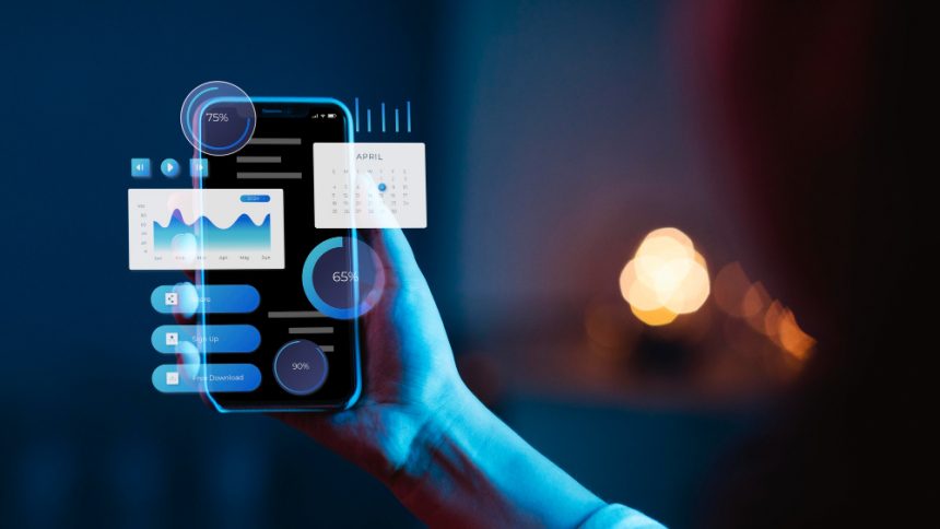
If the early 2010s were about discovery and adaptation, the 2020s have been about refinement, intelligence, and ecosystem-driven continuity. The design logic of mobile apps today no longer stops at the device screen—it expands across multiple entry points: watches, tablets, laptops, voice assistants, and even cars. Modern app design is no longer just about presentation; it’s about orchestration.
The flat design revolution, which took root around the mid-2010s, stripped apps of unnecessary decoration. Shadows, gradients, and textures gave way to minimal color palettes, crisp typography, and intuitive iconography. This aesthetic shift did more than modernize visuals—it simplified user cognition. Flat design allowed interfaces to become lighter, faster, and more accessible across devices with varying screen sizes and resolutions. It represented a broader digital maturity: users no longer needed visual metaphors to understand function; they expected clarity, consistency, and speed.
As design became more minimal, user expectations became more sophisticated. The rise of machine learning and contextual data paved the way for personalized experiences. Today’s apps analyze behavior—frequency of use, location patterns, time of interaction—to anticipate user needs before they are expressed. From predictive text and adaptive brightness to content recommendations and health tracking, modern mobile logic is built around anticipation rather than reaction.
Furthermore, the mobile ecosystem has moved from isolated app silos to connected environments. Cross-platform continuity, such as syncing tasks between smartphone and desktop, or picking up an article on a tablet where one left off on a phone, has become a hallmark of modern UX design. Systems like Apple’s Continuity or Google’s Material You aren’t just about consistent styling—they represent adaptive systems that mold digital experiences to users’ contexts, moods, and behaviors.
In parallel, accessibility and inclusivity have become non-negotiable components of design logic. Color contrast, haptic feedback, voice control, and assistive gestures ensure that apps are usable by people of all abilities. In this way, contemporary app design connects back to its earliest principles: empathy and usability. Yet the tools have evolved, reflecting deeper understanding and advancing technology.
The convergence of 5G, augmented reality, and AI integration is now pointing toward an even more contextual and fluid design horizon. Future apps may move beyond screens altogether, manifesting as ambient experiences—interactive environments that respond seamlessly to where we are, what we’re doing, and what we need.
Reflecting on the journey from the tactile skeuomorphism of 2010 to the adaptive ecosystems of today reveals a consistent truth: mobile app design is a mirror of human behavior. As our lives have become faster, more connected, and more data-driven, our digital tools have transformed to match. What began as a way to make technology fit in our pockets has become a philosophy of creating digital experiences that fit into our lives—with intelligence, empathy, and design thinking guiding every touch, swipe, and glance.